Typography is one of the most critical elements of business card design. The right font can convey professionalism, creativity, or luxury, while the wrong choice can make your card look amateurish. This guide will help you master the art of choosing and pairing fonts for business cards.
Understanding Font Categories
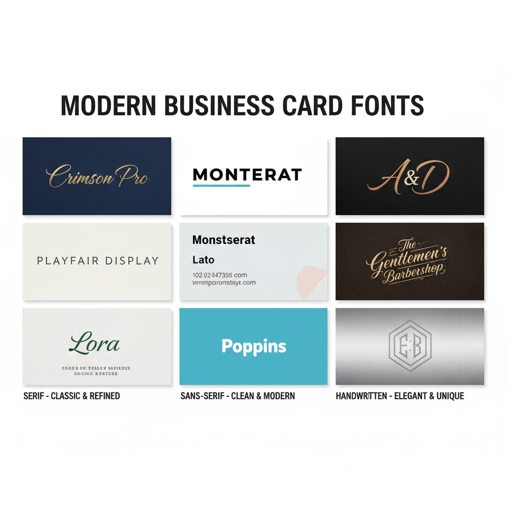
Serif Fonts have small decorative strokes at the ends of letters. They convey tradition, reliability, and professionalism. Examples: Times New Roman, Garamond, Baskerville. Best for: Law firms, financial services, traditional businesses.
Sans-Serif Fonts are clean and modern without decorative strokes. They convey simplicity, modernity, and approachability. Examples: Helvetica, Arial, Futura. Best for: Tech companies, startups, contemporary brands.
Script Fonts mimic handwriting with flowing, connected letters. They convey elegance, creativity, and personality. Examples: Brush Script, Edwardian Script. Best for: Wedding planners, boutiques, creative professionals.
Display Fonts are decorative and attention-grabbing. They convey uniqueness and brand personality. Use sparingly! Best for: Logos only, not body text.
The Psychology of Typefaces
- Serif fonts suggest trustworthiness and establishment
- Sans-serif fonts feel modern and accessible
- Bold fonts convey strength and confidence
- Light fonts suggest elegance and sophistication
- Condensed fonts maximize space but reduce readability
- Wide fonts feel stable and grounded
Font Pairing Rules
Rule 1: Contrast is Key - Pair serif with sans-serif for visual interest. Example: Playfair Display (serif headline) + Montserrat (sans-serif body).
Rule 2: Limit to 2-3 Fonts - More fonts create visual chaos. Use one for your name, one for your title/company, and optionally one for contact details.
Rule 3: Establish Hierarchy - Your name should be largest and boldest. Company name and title should be medium. Contact info should be smallest but still readable.
Rule 4: Consider Weight Variation - Using different weights of the same font family creates cohesion with hierarchy. Example: Montserrat Bold for name, Montserrat Regular for details.
Readability Best Practices
- Minimum 8pt font size for any text
- 10-12pt for contact information is ideal
- Avoid all caps for body text - harder to read
- Ensure sufficient contrast between text and background
- Don't use more than 2 font weights per typeface
- Avoid overly decorative fonts for essential information
Industry-Specific Font Recommendations
Legal/Finance: Garamond, Baskerville, Times New Roman - Traditional serif fonts convey trust and authority.
Tech/Startups: Helvetica, Futura, Proxima Nova - Clean sans-serif fonts feel modern and innovative.
Creative/Design: Custom or unique fonts that reflect your style - Show your design skills through typography.
Healthcare: Open Sans, Lato, Source Sans - Approachable, clean fonts that feel professional yet friendly.
Luxury/Premium: Didot, Bodoni, Trajan - Elegant serif fonts with thin strokes and high contrast.
Common Font Mistakes to Avoid
- Using Comic Sans or Papyrus (unless ironically for a very specific brand)
- Choosing fonts that are too similar (no contrast)
- Making text too small to read comfortably
- Using decorative fonts for contact information
- Stretching or distorting fonts to fit space
- Ignoring kerning (spacing between letters)
Testing Your Font Choices
- Print a test version at actual size
- View it from arm's length - is it readable?
- Ask colleagues for honest feedback
- Compare with competitors' cards
- Ensure it works in both color and black & white
Conclusion
Choosing the right fonts for your business card is about balancing aesthetics with readability, personality with professionalism. Take time to explore options, test combinations, and ensure your typography aligns with your brand identity. When in doubt, simpler is usually better—clarity always trumps creativity on a business card.